[1]:
from pystencils.session import *

import shutil
[2]:
try:
    from scipy.ndimage.filters import gaussian_filter
    scipy_avail = True
except ImportError:
    scipy_avail = False
Plotting and Animation
1) Stencils
This section shows how to visualize stencils, i.e. lists of directions
[3]:
stencil_5pt = [(0, 0), (1, 0), (-1, 0), (0, 1), (0, -1)]
plt.figure(figsize=(2, 2))
ps.stencil.plot(stencil_5pt)
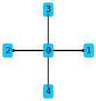
By default the indices are shown the arrow endpoints. Custom data can also be plotted:
[4]:
plt.figure(figsize=(2, 2))
ps.stencil.plot(stencil_5pt, data=[2.0, 5, 'test', 42, 1])
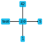
The stencil can also be given as an expression in a single field
[5]:
f = ps.fields("f: [2D]")
c = sp.symbols("c")
expr = f[0, 0] + 2 * f[1, 0] + c * f[-1, 0] + 4 * f[0, 1] - c**2 * f[0, -1]
plt.figure(figsize=(2, 2))
ps.stencil.plot_expression(expr)
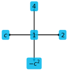
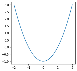
There is also a function to simply plot sympy expressions depending on one variable only:
[6]:
x = sp.symbols("x")
plt.figure(figsize=(4, 4))
plt.sympy_function(x**2 - 1, x_values=np.linspace(-2, 2));
Three dimensional stencils can be visualized in two different ways
[7]:
stencil_7pt = [(0, 0, 0), (1, 0, 0), (-1, 0, 0), (0, 1, 0), (0, -1, 0), (0, 0, 1), (0, 0, -1)]
ps.stencil.plot(stencil_7pt, data=[i for i in range(7)])
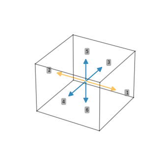
This kind of plot works well for small stencils, for larger stencils this gets messy:
[8]:
stencil_27pt = [(i, j, k) for i in (-1, 0, 1) for j in (-1, 0, 1) for k in (-1, 0, 1)]
ps.stencil.plot(stencil_27pt, data=[i for i in range(27)])
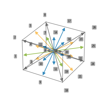
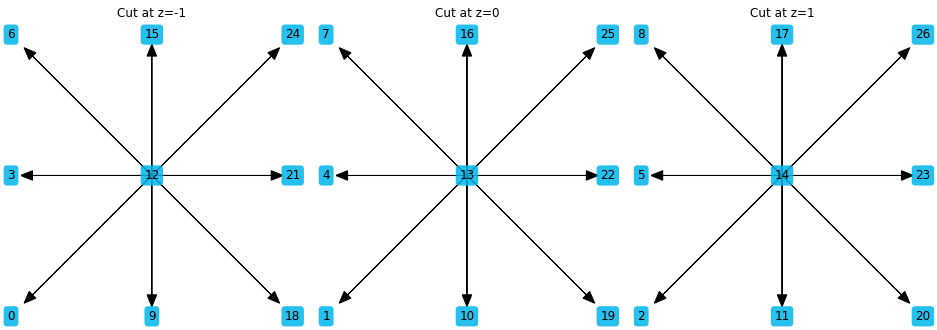
Adding slice=True shows the three projections of the stencils instead
[9]:
ps.stencil.plot(stencil_27pt, data=[i for i in range(27)], slice=True)
2) Scalar fields
pystencils also comes with helper functions to plot simulation data. The plotting functions are simple but useful wrappers around basic Matplotlib functionality. pystencils imports all matplotlib functions as well, such that one can use
import pystencils.plot as plt
instead of
import matplotlib.pyplot as plt
The session import at the top of the notebook does this already, and also sets up inline plotting for notebooks.
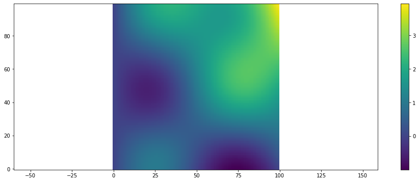
This section demonstrates how to plot 2D scalar fields. Internally imshow from matplotlib is used, however the coordinate system is changed such that (0,0) is in the lower left corner, the \(x\)-axis points to the right, and the \(y\)-axis upward.
The next function returns a scalar field for demonstration
[10]:
def example_scalar_field(t=0):
    x, y = np.meshgrid(np.linspace(0, 2 * np.pi, 100), np.linspace(0, 2 * np.pi, 100))
    z = np.cos(x + 0.1 * t) * np.sin(y + 0.1 * t) + 0.1 * x * y
    return z
To show a single scalar field use plt.scalar_field:
[11]:
arr = example_scalar_field()
plt.scalar_field(arr)
plt.colorbar()
[11]:
<matplotlib.colorbar.Colorbar at 0x15c806340>
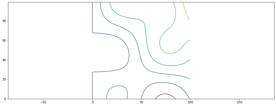
A similar wrapper around counter from matplotlib
[12]:
plt.scalar_field_contour(arr);
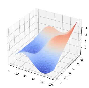
A 3D surface plot is also possible:
[13]:
plt.scalar_field_surface(arr)
[13]:
<mpl_toolkits.mplot3d.art3d.Poly3DCollection at 0x15c7a72e0>
For simulation results one often needs visualization of time dependent results. To show an evolving scalar field an animation can be created as shown in the next cell
[14]:
t = 0
def run_func():
    global t
    t += 1
    return example_scalar_field(t)
[15]:
if shutil.which("ffmpeg") is not None:
    plt.figure()
    animation = plt.scalar_field_animation(run_func, frames=60)
    ps.jupyter.display_as_html_video(animation)
else:
    print("No ffmpeg installed")
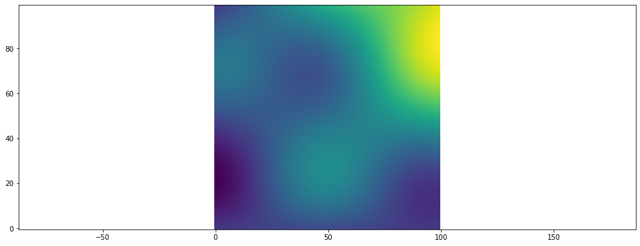
Another way to display animations is as an image sequence. While the run_func i.e. the simulation is running the current state is then displayed as HTML image. Use this method when your run_func takes a long time and you want to see the status while the simulation runs. The frames parameter specifies how often the run function will be called.
[16]:
plt.figure()
animation = plt.scalar_field_animation(run_func, frames=30)
ps.jupyter.display_as_html_image(animation)
For surface plots there is also an animated version:
[17]:
if shutil.which("ffmpeg") is not None:
    animation = plt.surface_plot_animation(run_func, frames=60)
    ps.jupyter.display_as_html_video(animation)
else:
    print("No ffmpeg installed")
3) Vector Fields
pystencils provides another set of plotting functions for vector fields, e.g. velocity fields. They have three index dimensions, where the last coordinate has to have 2 entries, representing the \(x\) and \(y\) component of the vector.
[18]:
def example_vector_field(t=0, shape=(40, 40)):
    result = np.empty(shape + (2,))
    x, y = np.meshgrid(np.linspace(0, 2 * np.pi, shape[0]), np.linspace(0, 2 * np.pi, shape[1]))
    result[..., 0] = np.cos(x + 0.1 * t) * np.sin(y + 0.1 * t) + 0.01 * x * y
    result[..., 1] = np.cos(0.001 * y)
    return result
Vector fields can either be plotted using quivers (arrows)
[19]:
plt.figure()
data = example_vector_field()
plt.vector_field(data, step=1);
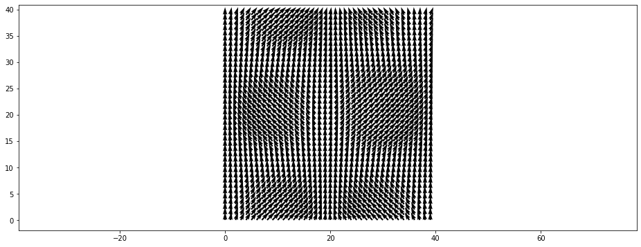
The step parameter can be used to display only every \(n\)’th arrow:
[20]:
plt.figure()
plt.vector_field(data, step=2);
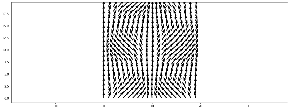
or by displaying their magnitude in a colormap
[21]:
plt.figure()
plt.vector_field_magnitude(data);
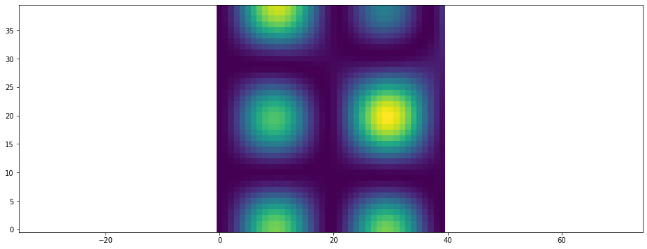
There are also functions to animate both variants, quiver plots..
[22]:
t = 0
def run_func():
    global t
    t += 1
    return example_vector_field(t)
[23]:
if shutil.which("ffmpeg") is not None:
    plt.figure()
    animation = plt.vector_field_animation(run_func, frames=60)
    ps.jupyter.display_as_html_video(animation)
else:
    print("No ffmpeg installed")
…and magnitude plots
[24]:
if shutil.which("ffmpeg") is not None:
    animation = plt.vector_field_magnitude_animation(run_func, frames=60)
    ps.jupyter.display_as_html_video(animation)
else:
    print("No ffmpeg installed")
4) Phase Fields
A third group of plotting functions helps to display arrays as they occur in phase-field simulations. However these function may also be useful for other kinds of simulations. They expect arrays where the last coordinate indicates the fraction of a certain component, i.e. arr[x, y, 2] should be a value between \(0\) and \(1\) and specifies the fraction of the third phase at \((x, y)\). The plotting functions expect that sum over the last coordinate gives \(1\) for all cells.
Lets again generate some example data
[25]:
def example_phase_field():
    if scipy_avail:
        from scipy.ndimage.filters import gaussian_filter

    shape=(80, 80)
    result = np.zeros(shape + (4,))
    result[20:40, 20:40, 0] = 1

    if scipy_avail:
        gaussian_filter(result[..., 0], sigma=3, output=result[..., 0])
    result[50:70, 30:50, 1] = 1
    if scipy_avail:
        gaussian_filter(result[..., 1], sigma=3, output=result[..., 1])

    result[:, :10, 2] = 1
    result[:, :, 3] = 1 - np.sum(result, axis=2)
    return result
data = example_phase_field()
The scalar_field_alpha_value function uses the last entry, i.e. the value between 0 and 1, as the alpha value of the specified colour to show where the phase is located. This visualization makes it easy to distinguish between smooth and sharp transitions. Note: If scipy is not installed, the phase-field will have a sharp interface because no gaussian filter was applied above. This is not realistic. However, it still shows the possibilities of the visualization functions here.
[26]:
plt.scalar_field_alpha_value(data[..., 0], color='b')
plt.scalar_field_alpha_value(data[..., 1], color='r')
plt.scalar_field_alpha_value(data[..., 2], color='k')
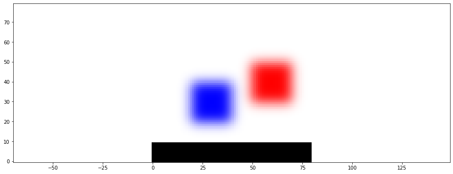
To see all existing phases the phase_plot function uses this alpha-value representation for all phases.
[27]:
plt.phase_plot(data)
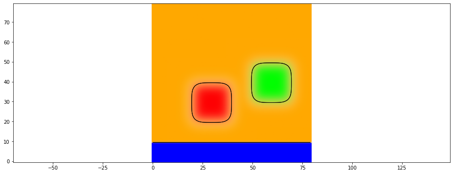
Another option to display each field separately in a subplot
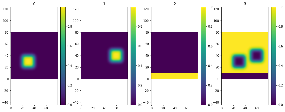
[28]:
plt.multiple_scalar_fields(data)
